Sunday 17 May 2015

Lab 12: Unmanned Aerial Systems

The last field methods class of the semester consisted of a trip out to the Priory, the site of the last three labs. This time, one of the students, Mike Bomber, and Dr. Hupy gave a basic tutorial on how unmanned aerial vehicles (UAVs) work in the field. Dr. Hupy began setting up the UAVs near the Priory parking lot which provided a fairly open piece of land away from a high number of traffic.

For most labs this semester, the weather was something that mattered for the comfort of the class, but not necessarily the inability to do the lab itself. With UAVs, however, weather is a limiting factor in the ability to fly a UAV. On this particular lab day, the weather conditions were very spotty with wind speeds of 7 to 9 miles per hour from the south east. The temperature was 52 degrees Fahrenheit.

This was a very step by step process. The majority of the time out in the field was dedicated to planning the mission, checking weather conditions, and checking the UAVs (unmanned aerial vehicles).

Just as the diagnostics were being checked, a battery was put into the remote controller, the connection fried and one of the students and I had to run back to campus to get a new rechargeable battery as well as AA batteries (see figure 1).

Figure 1. Dr. Hupy, Mike, and Zach going through the diagnostic check list before launching the first UAV.


Two UAVs were launched on the field day, the first being the Iris and the second being the Matrix, both were fixed wing UAVs (see figures 2 and 3).
Figure 2. Iris UAV.

Figure 3. Matrix UAV.

The Iris was much smaller and flew without any issues. When the Matrix was launched, the winds had picked up a bit. As the flight was in progress and the auto-pilot was flying the mission, Mike noticed that there were fewer satellites available to the UAV and the winds were starting to pick up and it was visibly noticeable that the UAV was being affected by the wind. Dr. Hupy informed the class that the robots have the capability to autocorrect for factors like wind, but sometimes they overcorrect themselves which makes them become more unstable. Due to this foreseeable issue, Mike instructed Dr. Hupy to abort the mission. Once this button was pressed on the remote, the UAV immediately began descending and landed with success (see figures 4 and 5).

Figure 4. The Iris pre-launch

Figure 5. Dr. Hupy controlling the UAV in manual mode before turning the controller onto 'mission mode'. 
After the launches were done, some member of the class used the TopCon HiPer to survey GPS points around the flight site. This would allow the imagery from the UAV to be later synced in the lab with the GPS data to provide a spatial existence for the imagery (see figure 6).
Figure 6. The Topcon HiPer was used again in this lab to determine GPS locations around the flight site. This would allow the imagery from the UAV to be later synced in the lab with the GPS data to provide a spatial existence for the imagery.


I really enjoyed this lab because I got to see a UAV in action after hearing about both the controversy and benefits of using them. In addition, lab 4's topic was about unmanned aerial systems mission planning. During that lab, the class used a flight simulator and experienced a small taste of what can all go wrong in a flight mission. To be able to see that in the field gave the class a more wholesome understanding of the technology in action.

To me, it was incredible at the precision and ability that a UAV possesses. Watching Dr. Hupy create the flight path on the iPad was incredible. I did not think that it would have been such a simple process, seeing as it seems to me that UAV technology is just gaining popularity in the hobby world.

Before we even left the field, we were able to see the imaging from the UAVs' flight. Dr. Hupy explained that this was a newer capability of technology. It used to be that one needed to process the imaging once going back into the lab. Because of the delay in imagery, it was often realized that there were glitches in the camera or other issues that would require another trip to the same field site. With the current technology, time and money is saved by being able to see the imagery right away (figures 7 and 8).

Figure 7. The processed aerial imagery post flight.

Figure 8. One image from the UAV in flight. The class can be seen in the top portion of the picture. The UAVs

I feel very fortunate to be able to have the chance to work with UAVs at my university. Such technology is a small area of geography, but with the capabilities of sensors and high resolution technology, UAVs are becoming extremely useful for geographers as well as the rest of society.

Tuesday 12 May 2015

Lab 11: Navigation with GPS

Introduction:

This lab was a continuation of last week's orienteering at the Priory. This week, however, was focused on creating a new orienteering course for the next field method's class in the fall. This involved using a GPS, as well as the navigation map used previously in labs 3 (Development of a Field Navigation Map) and 10 (Orienteering at the Priory).

The location of the orienteering course, the Priory, is a plot of land owned by the University of Wisconsin- Eau Claire, located 3 miles south of campus (see figure 1). This site is used for multiple purposes by the university including child care, student housing, and research projects conducted by university students. Most of the 112 acres are wooded, with a small portion of that land being the buildings for housing and child care. This wooded and hilly area provides a great place to hone in on orienteering skills.

Figure 1. Map of Eau Claire Wisconsin, which highlights the University of Wisconsin- Eau Claire and the Priory. The orienteering area at the Priory is highlighted above.

During this field day, the weather was absolutely perfect and gave the class a nice bit of sun on the skin. This made determining the precise location of points more thought out in the visibility of the trees from the orienteering direction of travel as well as pleasantness of the activity as a whole.

Methods:

Prior to going out into the field, ArcMap was used to plot roughly where 5 navigation points would be located on the Priory grounds for the orienteering course. The course was chosen based on elevation change, distance from point to point, and ability for the course to be mostly independent from the other courses being made by classmates at the Priory. This map was then exported to the Trimble Juno GPS device so the map could be viewed in the field and the exact GPS points could be taken (see figure 2).

Figure 2. Trimble Juno which was used in the field to collect navigation points on the orienteering course. This was then imported into ArcMap to create a navigation map for next semester's field methods class.

Once at the Priory all of the groups, which were the same as the week before, crosschecked with each other to make sure that the orienteering courses were in different parts of the Priory. Once this was done, every group was given a Sharpie and pink tape. These would be the means in which to mark the trees that served as the individual navigation points. Prior to entering the field, the group  referenced the points taken on the Juno prior to getting into the field and placed them roughly where they should have been placed on the map. This allowed the group to 'orienteer' to the points that were tentatively marked on the map. Our group number was 3, so all of the navigation points are marked 3.1. 3.2... (see figure 3).


Figure 3. This is the navigation map that was used as a reference in the field. The group referenced the points taken on the Juno prior to getting into the field and placed them roughly where they should have been placed on the map. This allowed the group to 'orienteer' to the points that were tentatively marked on the map. Our group number was 3, so all of the navigation points are marked 3.1. 3.2...
At each navigation point, the pink tape was wrapped around the tree roughly 5 feet off the ground. On the tape, Sharpie was used to identify which navigation point was which on the course. A picture was then taken of the tree and the Juno was used to create a GPS point on the exact location of the navigation point (see figures 4 through 7). 
Figure 4. Navigation point 3.1. The number of the navigation point was marked in Sharpie on the tape.
Figure 5. Navigation Point 3.2.
Figure 6. Navigation point 3.3.
Figure 7 . Navigation point 3.5.


Once all of the points were collected in the field, the Juno data was imported back into ArcMap to be made into an orienteering course map (see figure 8).


Figure 8. Final orienteering map with the 5 exact GPS points. This map can be used for next semester's field methods class. The scale bar was done in meters to be comparable to the 'pace count' that was set at the beginning of the semester that was based on pace for 100 meters. 

Discussion:

Because of the dense tree cover it was initially difficult to get a signal to show up for the GPS. The Juno worked fine throughout the lab after walking into a clearing and giving it time to find a signal.

Once reconnecting the Juno to the desktop, it took quite some time to be able to import the data. The device said that no information could be checked in because the file type was unable to be exported. After a lot of troubleshooting done by one of my group members, the data was finally able to be imported.

After completing the field portion of this lab, it was interesting to hear how other groups found their predetermined navigation points. One group used the locator arrow on the Juno and followed it to their predetermined point. By using this, they did not have to go through the means of actually orienteering.

Conclusion:

I really enjoyed partaking in the entire process of completing a navigation map for an orienteering course, doing the actual orienteering, and then making my own orienteering course based on all of the skills learned in previous labs. I liked the refresher on how to use the Juno in the field and the combination of old school map and compass work of orienteering combined with the hi-tech use of the Juno to map GPS points. It makes you realize that you need to know how to use new technology as well as remain familiar with using a map.

I recently went on another orienteering course in northern Minnesota, and I soon realized that the points were 'off' in relation to the course. Because of that, I spent over 30 minutes attempting to find a point that was supposed to be located along a power line, which should have been easy. However, it was not located between the contour lines it should have been, so my ability to complete the course was affected.

Monday 4 May 2015

Lab 10: Orienteering at the Priory

Introduction:

This week's lab took the class out orienteering in wooded property owned by the university. Orienteering is often viewed as a competitive outdoor hobby that requires navigating from given point to point in unfamiliar territory using only a compass and map. This lab is very different from other labs in that no modern technology is used. This can be helpful in the real world in times of technology failure and the like.

The location of the orienteering course, the Priory, is a plot of land owned by the University of Wisconsin- Eau Claire, located 3 miles south of campus (see figure 1). This site is used for multiple purposes by the university including child care, student housing, and research projects conducted by university students. Most of the 112 acres are wooded, with a small portion of that land being the buildings for housing and child care. This wooded and hilly area provides a great place to hone in on orienteering skills.


Figure 1. Map of Eau Claire Wisconsin, which highlights the University of Wisconsin- Eau Claire and the Priory. The orienteering area at the Priory is highlighted above.

A map was created in lab 3 (see figure 2) that depicted the area of the Priory using a Universal Transverse Mercator coordinate system. Because the grid is divided by meters, not degrees, it proves very helpful in navigating with a map. This is because one can easily determine distance using the grid system and not just the scale bar. In addition, knowing one's pace for 100 meters gives the map user the ability to physically pace out the intended distance from point to point. In lab 3, the class individually measured their pace count to reach 100 meters; this information played an important role in being able to estimate distance in the field during this lab.

Figure 2. This navigation map was created back in lab 3 to illustrate the orienteering course at the Priory.  The digital elevation model (white to green coloration), imagery, and contour lines were included on the map to aid in the ability to 'orient' ones' self while orienteering.


Methods:

The class was split into teams of 3 and given 5 UTM coordinates to find in the woods. First, the route needed to be mapped out from the given UTM coordinates (i.e. point 1-2, point 2-3…etc.). This would then allow the groups to determine how far each point was from one another and determine the number of paces that it would likely take to get from point A to point B (see figures 3 and 4).

Figure 3. This is this area in which the orienteering course took place.  There was a miscommunication between the class and the professor about where the point boundary for the course would take place. Ergo, some of the orienteering points assigned to the class ended up outside of the visible map and onto the legend.


Figure 4. Instead of the originally thought orienteering boundary (the yellow rectangle), the course ended up taking place in the red circle, which prevented the digital elevation model (white to green coloration), imagery, and contour lines to be seen. This could have effected the efficiency in which the groups were able to navigate their orienteering points.


Three people in the group were needed in order to effectively and efficiently take on the orienteering course. It could have been done with less people, but it could have been harder to keep track of the angle of travel, distance etc.

One person generally oriented the compass and the map. To do such, the compass was placed on the map and its edge was used to determine the azimuth between point A and point B, for example. This was done by facing the 'direction of travel' end of the compass toward the direction of travel on the map  (see figure 5). If this is facing the opposite way during the orienting step, the orienteers will go in the opposite direction of desired travel. Next The dial on the compass needs to have the north facing the north on the map. Once this is done, you put 'red' in the 'shed' and follow 'Fred' meaning that you turn with the compass parallel to the ground until the moving arrow (red), into the red area on the compass (shed), and then follow the 'direction of travel' arrow (Fred), until you reach your destination. Keep in mind, that the moving arrow must stay facing north for the entirety of travel.


Figure 5. Note the 'start' and 'destination' line on the left side of the compass. The compass's straight edge serves as the intended path of travel. Also notice how the 'direction of travel' arrow on the compass faces the 'destination' point on the map, this is a vital step in the process. The dial on the compass needs to have the north facing the north on the map. Once this is done, you put 'red' in the 'shed' and follow 'Fred' meaning that you turn with the compass parallel to the ground until the moving arrow (red), into the red area on the compass (shed), and then follow the 'direction of travel' arrow (Fred), until you reach your destination. Keep in mind, that the moving arrow must stay facing north for the entirety of travel.

Another member of the group would then hold the compass and be in charge of maintain the direction of travel. As the stood stationary, a runner would go ahead of the group and the compass holder would tell the runner to go left or right in order to be in line with the direction of travel. The third person was the pacer, who used their pace count (determined back in lab 3) to determine the approximate distance from one point to the next. This method worked very efficiently, as we were able to locate all of the points with relative ease. Below are a couple of pictures that indicate what the tagged orienteering trees looked like (see figures 6, 7, and 8).  
 

Figure 6. As is fairly clear, seeing pink tape is not always as easy as it looks. The class was told that all of the orienteering points would be located on birch trees, which helped, but it was still somewhat difficult to seek out the marked trees.


Figure 7. Here I am holding a part of the pink tape around the orienteering destination points. The points were located on birch trees, which aided in navigation.

Figure 8. A close up image of the pink taped destination points. The words 'pt 2' helped indicate the orienteering point destination, which helped in reassuring location during orienteering.
 
Discussion:

One of the issues we ran into was the location of the point boundary on the UTM map that was used. The topography was basically obsolete because the legend was in the way of the orienteering location as a result of a miscommunication of the class with Professor Hupy. This meant that we had to strictly rely on the use of our pace count. Most of the time we would underestimate the size of our footsteps and end up at our destination before we finished pacing out the number of steps we thought it would take us to finish.What made the pacing difficult was the elevation change which made it difficult to gauge the size of steps. This, in turn, created more of a guessing game for finding the orienteering points. However, although our pacing was off, the angle of direction was always correct, so having one out of the two orientations worked out just fine!

Another issue right from the start of the orienteering experience was the estimation of the location of the points on the map. Given that the UTM was grid was marked every 50 meters, there was quite a bit of room for estimation error. This was proven when my partners and I compared our hypothesized orienteering points; none of them were truly accurate so we had to estimate the points' location, meaning that the angle of the path was always 'off' a bit. This was not a big deal in a small area such as the Priory, but it would play a more important role in a larger orienteering course.

Our group did not have this issue, but some groups had a difficult time using their map because their grid system lacked detail. The grid that was used in our map was 50 by 50 meter, and quite honestly it could have been increased in detail, however, then the issue comes with visibility of the rest of the map then.

The rest of the map, the imagery, digital elevation model, and contour lines were very helpful and not distracting when navigating at the Priory. However, because the legend was in the way of much of the course, the other features of the map were used a lot less than they probably would have been if the course had been completely visible on the map.

Conclusion:

I had previously done some orienteering, but it is always good to refresh one's skills. The nice thing about orienteering is that virtually everyone can have access to a map and compass, unlike a lot of the other technology that we have been using throughout this semester. In addition, it is a good idea to have this as a back up plan in case all forms of technology fail in the process of navigating in a remote area.

We were also provided a unique experience in being able to design our own orienteering maps to use in the field. Most people orienteering use existent maps, but it gives you a bit more satisfaction when the map you created, in combination with orienteering skills, helps you locate the orienteering points.

Sunday 26 April 2015

Lab 9: Comparing Surveying Methods: Total Station vs. Dual Frequency GPS

Introduction:

The class was introduced to two labs over a two week period. They both had the same goal in that points were to be collected using survey grade GPS units on the University of Wisconsin-Eau Claire's campus mall (see figure 1). The last lab using the distance/azimuth survey of the Davies Student Center parking lot was very useful, but there were many errors found in the results once imported into ArcMap. With this method of surveying, there was no way in which to calculate elevation, however, with the two GPS survey grade devices used in this lab, distance, azimuth, and elevation could be calculated.

Figure 1. Image of the campus mall. Take note of the Little Niagara Creek in the bottom portion of the image.

The means in which the points were to be collected were by using a Topcon HiPer GPS (see figure 2) and Topcon Total Station (see figure 3). Our professor, Joe Hupy, gave the class hands on tutorials for using the equipment before the class was split into groups of two to collect the data. He stressed the importance of taking the time to make sure the GPS's were level on the ground, because without it, the data collected would basically be obsolete.


Figure 2. Topcon HiPer (device on the end of the stand) and Tesla (held in man's hand) used for the dual frequency GPS survey.
Figure 3. Topcon Total Station device. This was used in the second survey. Unlike the HiPer, the Total Station was stationary which required a second person to hold the reflector pole in order to capture a point (as seen by the man in the distance). 

Methods:

There were two parts to this lab, the first portion of the lab focused on the use of the dual frequency GPS, also known as the Topcon HiPer. For this survey system, a free standing post was used in which the HiPer GPS was connected to the top. A circle level is located on the device which is to be used to level the GPS before taking a point. The Tesla, for both surveying methods, was used as the field controller which regulated how the points were stored (see figure 4). The particular program that was used for this surveying was called Magnet. Once the HiPer was level, the Tesla was activated to collect the GPS point wirelessly from the HiPer via Bluetooth (see figure 5).

Figure 4. Tesla field controller. This device was used in both surveys to control the point collection via wireless Bluetooth.


Figure 5. Taking points using the Topcon HiPer. Note that the legs of the post are not being used.

The second method of surveying involved the Topcon Total Station. This required a number of tools to be brought into the field including the Tesla, HiPer with the pole, Total Station with a tripod, flags (for marking the occupied point and back site point), and a reflector with a pole (see figure 6). In order to use the Total Station, the HiPer was used to take two points, the occupied point (where the Total Station would be set up for point collection) and the backsite point which was used a spatial reference in relation to the occupied point.

After the two points were collected, the Total Station was centered and leveled on the occupied point flag. This was done by using the 'laser plummet' from the bottom of the Total Station and moving the tripod legs up and down. The elevation points could then be collected. Unlike the HiPer, the Total Station remained stationary and the person holding the reflector moved around the survey area (see figure 7). The Total Station has a viewer in which the person controlling the Total Station matches the middle of the reflector with the center of the Total Station viewer in order to collect accurate distance/azimuth information. In addition to those two jobs, a third person was used in this survey to control the Tesla (see figure 8).

Figure 6. Reflector head used with the Total Station laser to gauge distance and elevation. The reflector that was used for the class was set on top of a 2 meter pole.


Figure 7. Using the Topcon Total Station with the reflector pole (seen in the distant right).

Figure 8. Galen is using the Topcon Total Station to find the reflector point while I am using the Tesla to collect the points wirelessly from the Total Station.

The data for both surveys was imported as a text file (see figure 9) and then brought into ArcMap to be turned into x, y coordinates to give the points a geographic location.
Figure 9. The text file that was imported from the Tesla unit for one of the surveys. Note that the text is coded by name, longitude, latitude, and height, thus giving the x, y coordinates of the points.


To be able to visualize the campus mall's elevation, an interpolation tool was used in ArcMap to develop the static GPS points into a continuous visualization. The interpolation type that was chosen was the triangulated irregular network or TIN interpolation. Below are the two dimensional interpolations created in ArcMap. These figures indicate a gradual decline in elevation toward the Little Niagara Creek, seen in the bottom of the images (see figures 10 and 11).

Figure 10. TIN interpolation of the points collected via HiPer GPS.


Figure 11. TIN interpolation of the points collected via Total Station GPS.
Once the interpolation was created in ArcMap, the interpolation was opened in ArcScene to be able to create 3D imaging of the study area, thus providing an x, y, and z coordinate visualization (see figures 12 and 13).

Figure 12. TIN of HiPer survey points. The left tip of the image shows the area surveyed closest to the Little Niagara Creek, where as the right tip is closest to Schofield Hall.

Figure 13. TIN of Total Station survey points. The left tip of the image shows the area surveyed closest to the Little Niagara Creek, where as the right tip is closest to Schofield Hall.

Discussion:

While there is a generally downward sloping trend toward the creek, it is difficult to compare our two survey methods. Our group thought that the points collected in during the HiPer survey would be collated as a class, which would have given a better sampling area. In the analysis of the TIN topographic map using the Total Station, there appeared to be an area in which the elevation seemed much higher than it actually was in the field. It would be interesting to take a more in depth look at why that portion of the interpolation seems 'off'. It could be that not enough points were taken so the elevation seems more exaggerated than it actually is.

Technology, no matter how good one is at using it, can be an annoyance. Using the Tesla GPS and connecting it wirelessly to the HiPer and Total Station was quite tricky at times. There was a particular order in which the devices needed to be connected and disconnected via Bluetooth. My partner and I attempted to connect to the Total Station for a couple of hours and then had to go back out the next day to try again. We basically did the same steps for both days, but we must have changed one small thing the next day to make the Total Station connect to the Tesla.

An annoyance of using ArcMap in this particular situation was that the interpolation layer and basemap were not visible on the same layer. This is potentially due to my lack of in depth use in ArcMap, but I know that other people ran into the same issue. In addition, others had trouble lining up the points with the campus mall basemap.

The biggest difference between the two GPS survey systems was the ease and set-up time. The total station required a long process to set up the equipment, including using four different leveling processes and matching a laser to the precise point where the occupied point was taken. The Topcon HiPer was much quicker, but probably slightly less accurate due to the device needing to be moved around to every GPS point, which required the user to level the device before taking a reading.

Another difference between the two surveying methods is the number of people required during the process. The HiPer could definitely be done by one person, but when doing the total station, you need at least two people, preferably three. This is important to take note of when choosing a surveying technique in the future.

Conclusion:

Using survey grade GPS systems requires much more time and effort than a Trimble or less accurate GPS does. I have found that throughout this course, I have learned many ways in which to collect and export data into ArcMap. In future projects, I will have a much greater grasp on what the different surveying methods entail. This will allow me to appropriately choose my method of collection depending on the job required.

In addition, these labs made me realize the importance of apprenticeship. When working with the Total Station, it was apparent that asking others for help through their experience (and failures) was vital in understanding how to use the Tesla in combination with the total station.

Sunday 5 April 2015

Lab 8: Distance/ Azimuth Survey Methods

Introduction

This week, our professor explained to the class how there can often be technical issues that occur in the field that prevent one from using a GPS. Subsequently, it is a good idea to know how to use an alternate way to accurately measure points. This other way uses angles and distance to calculate the location of points.  The purpose of this week's lab was to create a map using the distance-azimuth sampling technique.

Azimuth and distance were the major categories of information that needed to be gathered for this lab using the Tru Pulse laser (see figure 1). The azimuth, also known as bearing, is collected between 0 and 360 degrees, just like on a compass. Distance, for this lab, was collected in meters.


Figure 1. TruPulse laser which has the ability to read distance in meters and azimuth.

The survey area chosen for this lab for this particular group was the parking lot on the south side of Davies Student Center on the University of Wisconsin- Eau Claire Campus (see figure 2). This particular area was chosen based on its large number of potential data collection points. In addition, it contains a clear perimeter boundary as well as a distinctive area in which cars should be parked. This would then allow for analysis of the results to be derived from where the points of the cars were survey and the general area in which the car points should have been.

Figure 2. This image displays the panoramic view where the survey station was located.


Methods

The class split up in groups of two. Each group was allowed to use the laser as well as a tripod to remain steady throughout the surveying process (see figure 3). The survey data was collected by hand because the purpose of this lab was to minimize the potential amount of electronic based errors. A variety of fields were surveyed including survey point number, distance, azimuth, type of car, and color of car. X and Y fields were included to later be inputted into Excel to display latitude and longitude of the survey station.

Figure 3. Galen diligently 'firing' the TruPulse laser at cars in the parking lot to calculate distance and azimuth.


Once collecting 92 points, the group ran out of time and survey points to collect 8 more (as was suggested by Professor Hupy). The handwritten survey results were then typed into Excel (see figure 4). A vital piece to using this method is knowing the geographic coordinates in which the survey station is set up. Without this, the points taken are obsolete because there is no spatial connection to their location on Earth. The first time the group attempted to use geographic coordinates, the latitude and longitude were inputted backwards. This gave the group much confusion until taking a step back and looking at the pieces of the puzzle. Note that the x and y coordinates are the same because they were taken at the same survey station.


Figure 4. This is a partial copy of the Excel document. Note that there are six fields of information: azimuth, distance, type, color, and x and y. 

ArcMap was then used to display and interpret the results of the survey. In order to display the distance and azimuth angle together in a spatial setting the 'bearing distance to line' tool was used. This tool asked for the input table (the Excel survey file), x field (latitude), y field (longitude), distance field (distance column from Excel file), and bearing field (azimuth column from Excel file) (see figure 5). To see the visual of what this tool takes into account during its calculation, see figure 6. The output with its line features is seen below (see figure 7).


Figure 5. This is the bearing to distance line tool 
Figure 6. This is a visual display of what ArcMap computes to account for distance, azimuth (bearing), and x and y coordinates.

Figure 7. Output of the 'bearing distance to line' tool. Notice the lines are all derived from the single point in the eastern central portion of the map.
Once the 'bearing distance to line' tool was complete, the end points needed to be gathered to create a traditional looking point system without the azimuth lines. The tool used for this was called the 'feature vertices to points'. This tool asked for the input feature, which was the product of the 'bearing distance to line' tool. It then gave the option of 'point type', and 'end point' was chosen so that the point in which the laser hit the object would be shown (see figure 8). This would then give the group a display of the accuracy of the laser throughout the survey (see figure 9).

Figure 8. Feature Vertices to Points tool. This tool gave the output for the final visual as seen in the final map below.  The input feature for this tool was the output from the 'bearing distance to line' tool. The point type chosen was 'endpoint' to display the point in which the laser hit the surveyed car or light post.

Figure 9. Distance Azimuth Survey map. This shows the various types of car survey points that were collected. As the points got farther away from the survey base, the accuracy, based on the existing cars in the basemap parking lot, lessened. The long string of red points extending to the western portion of the map were intended to be the first set of double cars closest to Davies Student Center and Phillips Science Hall. 


Discussion

After the points were calculated in the 'feature vertices to points tool', the endpoints produced a different output than what we were expecting. The first 15 points taken very close to the survey base seemed accurate in relation to the location of the campus basemap cars, but there were also points found in Putnam Park outside of the parking lot as well as in regions that would be normally used by cars driving through the parking lot. This was also seen in the light posts which were displayed much closer to the southeastern portion of the parking lot than they should have been.

As had been mentioned in prior posts from other Field Method classes, the farther away the points were taken from the laser, the more inaccurate they seemed to be. However, that could have also been due to the small area of car that was visible for the laser to pick up.

If more time had permitted, it would have been interesting to take a GPS out and map the same points to see how the GPS and laser compare in accuracy.

One change that could be made in the future on the data collection is using more than one survey base to conduct the data. We chose one base because we wanted to put the laser to the test to see how accurate it was, in addition to not wanting to collect points from the same car multiple times.

Conclusion

This lab was intriguing because it reminded me that I should always have a back up plan in case my technology fails. Although this was definitely more of a hassle than simply using a GPS, it was good to learn another way of plotting points on a map.

Unlike a GPS, the laser needs to read the angles and distance from a single point (the survey base), which means that the desired survey points from a farther distance will not only be harder to 'hit' with the laser, but likely less accurate because of the room for error in both the distance and azimuth readings. Through this conclusion, the type of data needing to be collected using the distance-azimuth method should be in close proximity to the survey base.

Sunday 15 March 2015

Lab 7: ArcPad Data Collection II

Introduction

This week's lab was yet another continuation of the weeks prior. Last week consisted of testing out the microclimate geodatabase in the field, which then led to the understand of what worked and what did not. For lab this week, a refined geodatabase was created for the entire class (thanks to Zach Hilgendorf) in order to be able to go out into the field to collect data and bring it back into one ArcMap document. The purpose of this lab was to connect the past few week's knowledge and create the full microclimate data set for the entire campus by using the Trimble Juno GPS (see figure 1) to record the data in combination with the Kestrel weather meter (see figure 2).


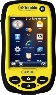
Figure 1. This is the Trimble Juno GPS that was used in the data collection during this lab. It has the capabilities of an ArcPad application which allows for data collection directly into the mobile version of ArcMap.
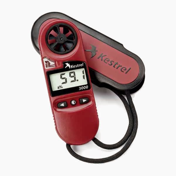
Figure 2. This is the Kestrel 3000, which measured temperature (at the surface and 2 meters), wind speed, wind chill, dew point, and percent humidity for the microclimate data collection in this lab.

Methods

Before heading out into the field, it was vital that everyone was able to deploy the correct map and database onto their Juno to ensure that no mistakes were made. If errors were realized either in the field or once back in the lab, the entire data collection process would have to be redone to ensure accuracy.

The University of Wisconsin- Eau Claire campus is geographically distinctive in that it has a large hill (or more accurately a terrace) that divides lower campus from upper campus as seen in figure 3. Lower and upper are divided by the string of trees in the south west portion of the map. In addition, the Chippewa River runs along the north side of campus with a footbridge running over it for pedestrians to cross to get off campus or to the two academic buildings over the river.

For the data collection, the same features were collected as for the last data collection: temperature at the surface, temperature at two meters, windchill, dewpoint, humidity (%), wind speed, ground cover, and notes. One feature was neglected, wind direction, because of lack of compasses for the class. The class was instructed to collected about 100 GPS points per groups of two and assigned a specific area on upper or lower campus to cover. One member of the group was in charge of using the Kestrel to determine the various climatic readings, while the other member inputted the data taken from the Kestrel to the Trimble Juno.

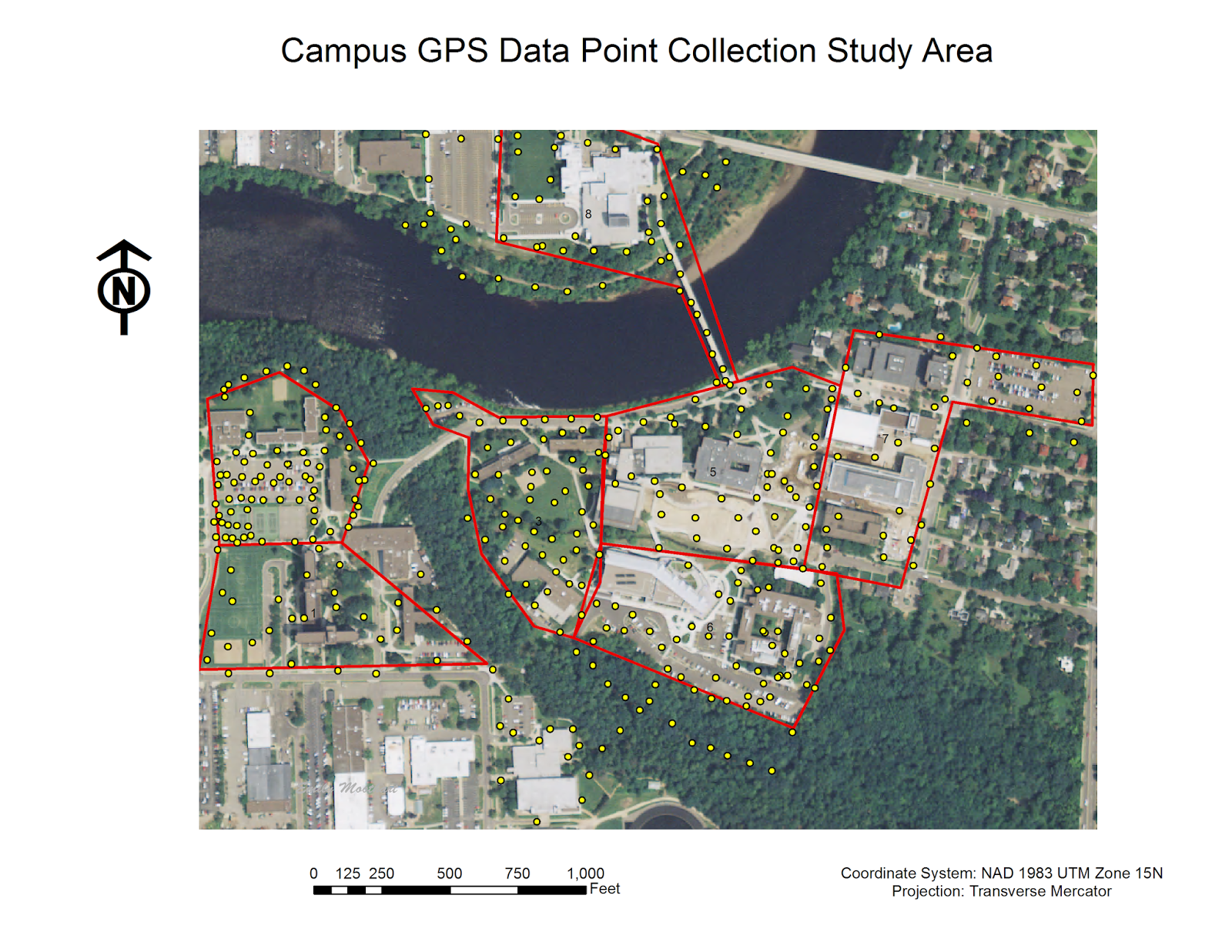
Figure 3. Campus GPS Data Point Collection Study Area. This map depicts all of the points that were collected throughout lower campus (central portion of map) and upper campus (western portion of map). The red polygons indicate the data collection areas assigned to groups of two.

Once all of the data was collected by the class, the data was imported into a single feature class in one ArcMap file. This allowed the entire class to have access to each other's points in an editable form. In order to see continuous microclimate data for the campus, an inverse distance weighted (IDW) interpolation was performed. This interpolation technique was used for its ability to see local variation with a large number of sampling points.

Overall, the data showed a clear indication that Putnam Park (the heavily wooded region in the south west portion of the map) was cooler in temperature than the rest of the campus.

One weather measurement that was run was dew point (see figure 4). This is defined as the temperature at which the moisture in the air forms visible drop of water. This test was conducted in Fahrenheit.

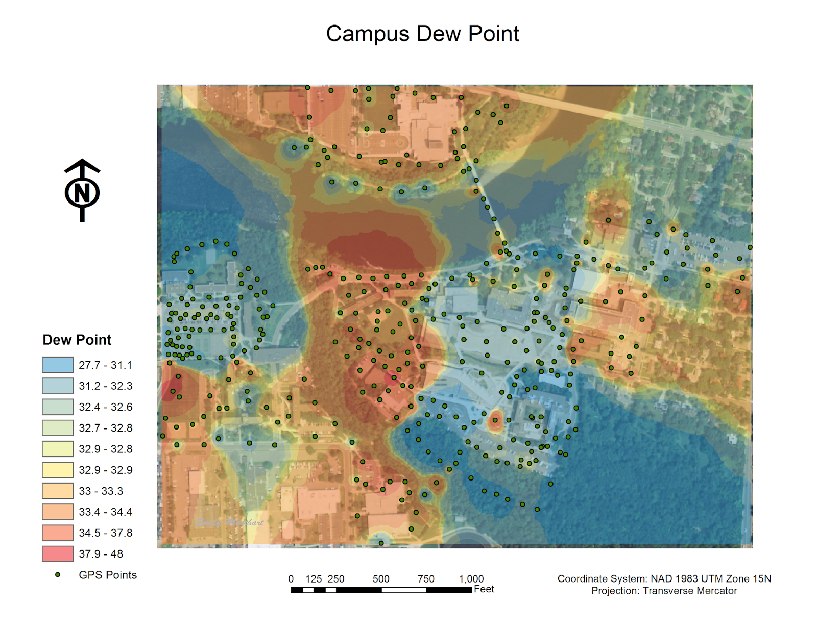
Figure 4. Campus Dew Point (Fahrenheit). The regions that have higher dew point are generally areas around open water, or in the case of this particular day on campus, waterlogged because of the snow melting. The lowest dew point is located in the general area of the parking lots which contain a lot of cement, and likewise almost no water.

Relative humidity is another variable that was tested for the campus microclimate (see figure 5). It is defined as the ratio of partial pressure of water vapor to the equilibrium vapor pressure of water at the same temperature.

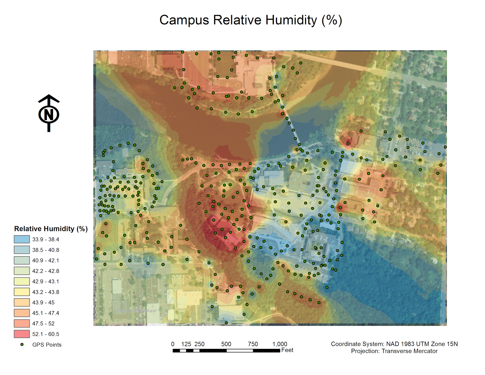
Figure 5. Campus Relative Humidity. This map is almost identical to the dew point map above. The regions that have higher humidity are generally areas around open water, or in the case of this particular day on campus, waterlogged because of the snow melting. The lowest relative humidity is located in the general area of the parking lots which contain a lot of cement, and likewise almost no water.  

Temperature is an easy to understand concept that really aids in the initial understanding of a microclimate (see figure 6). Although at first it did not make sense that the yellow symbol was consuming the map, it was realized that the range of the symbology was between 0 and 60 degrees Fahrenheit. This is obviously an input error that effected the output of the map display.

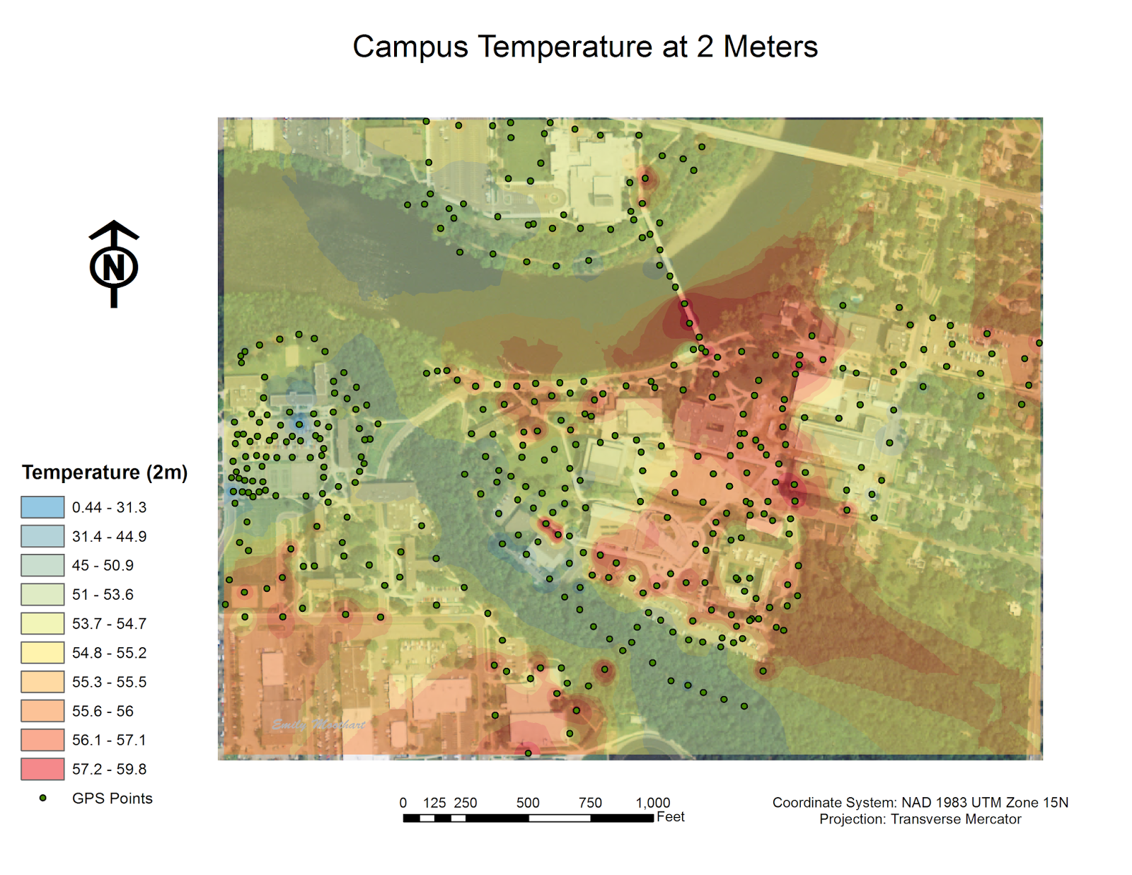
Figure 6. Campus Temperature at 2 Meters (Fahrenheit). The coldest regions on the map are the ones located under tree cover. After analyzing the attribute table, it was realized that one of the groups neglected to include any two meter data. The 'null' area is shown in the middle of the red segment in the east-central portion of the map. With more data, there would have likely been more variation in interpolation output. 

Although temperature at the surface should be very similar to the temperature at two meters, it is still important to collect the data to compare the variation between the two temperature readings (see figure 7).

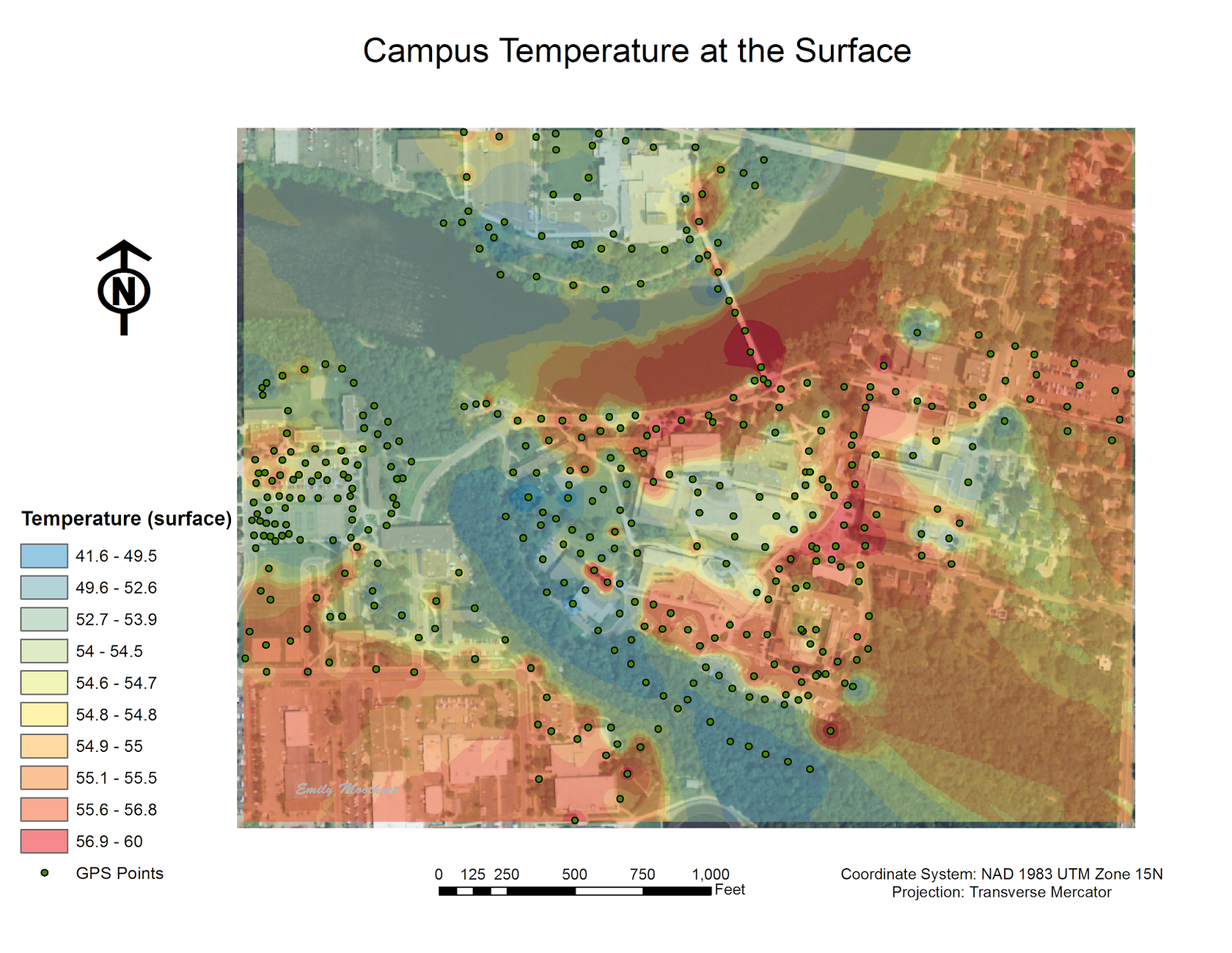
Figure 7. Campus Temperature at the Surface (Fahrenheit). The coldest regions on the map are the ones located under tree cover. This is similar to the campus temperature at two meters.

Relatively high wind speed have an effect on this campus largely due to the Chippewa River running through it. Below is a map indicating the wind speeds, in miles per hour, throughout the campus (see figure 8).

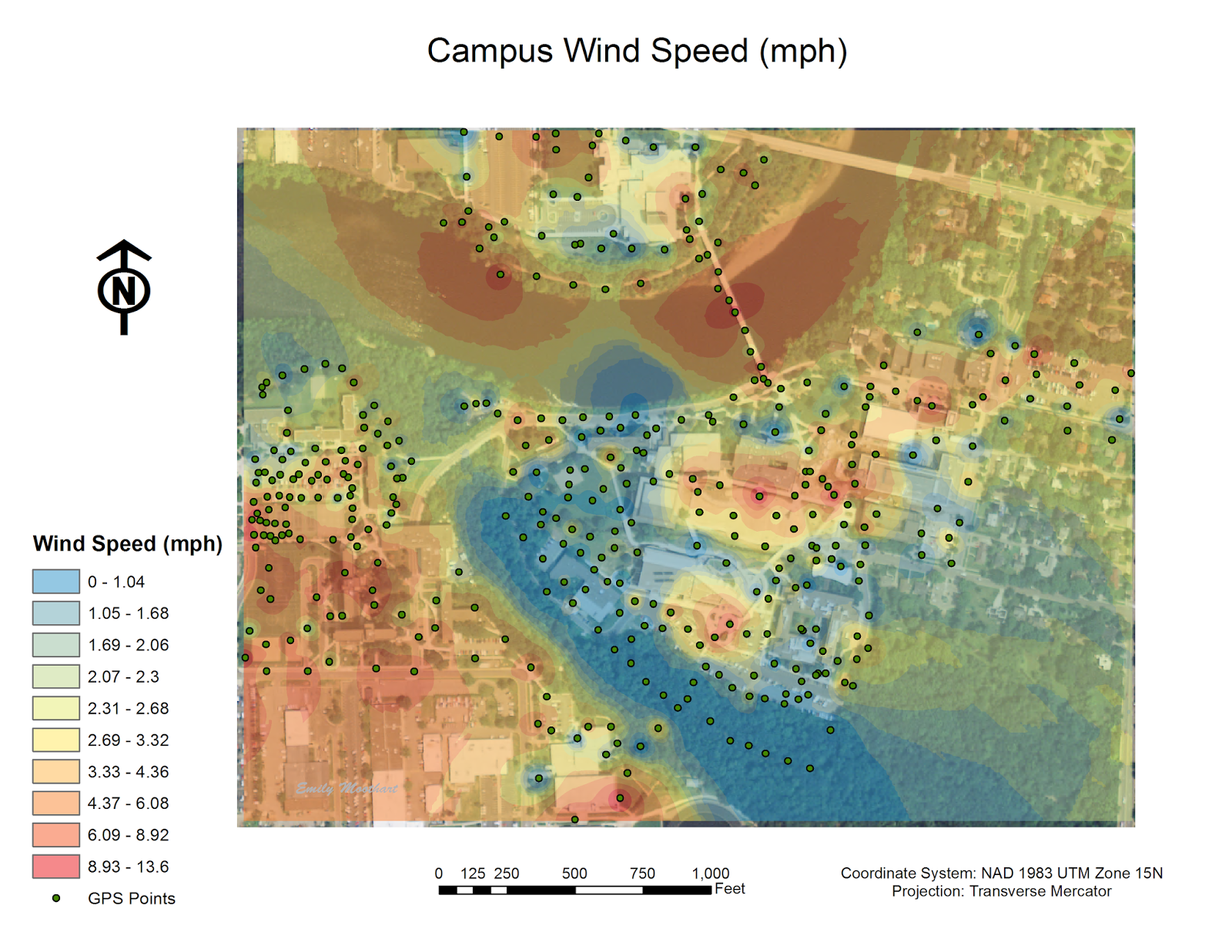
Figure 8. Campus Wind Speed (miles per hour). There is a direct correlation to where the tree cover is and the wind speed. In Putnam part, there were no wind where there is the most tree cover. In addition, exposed areas along the river's shore have higher wind speeds.

Wind chill is another weather variable that was measured (see figure 9). Wind chill is the perceived decrease in air temperature felt by the body on exposed skin due to the flow of air. Wind chill is always lower than the air temperature when the formula is valid. The issue with using the Kestrel is that there are often readings of the wind chill that are higher than the temperature of the surface or at two meters, which is inaccurate.

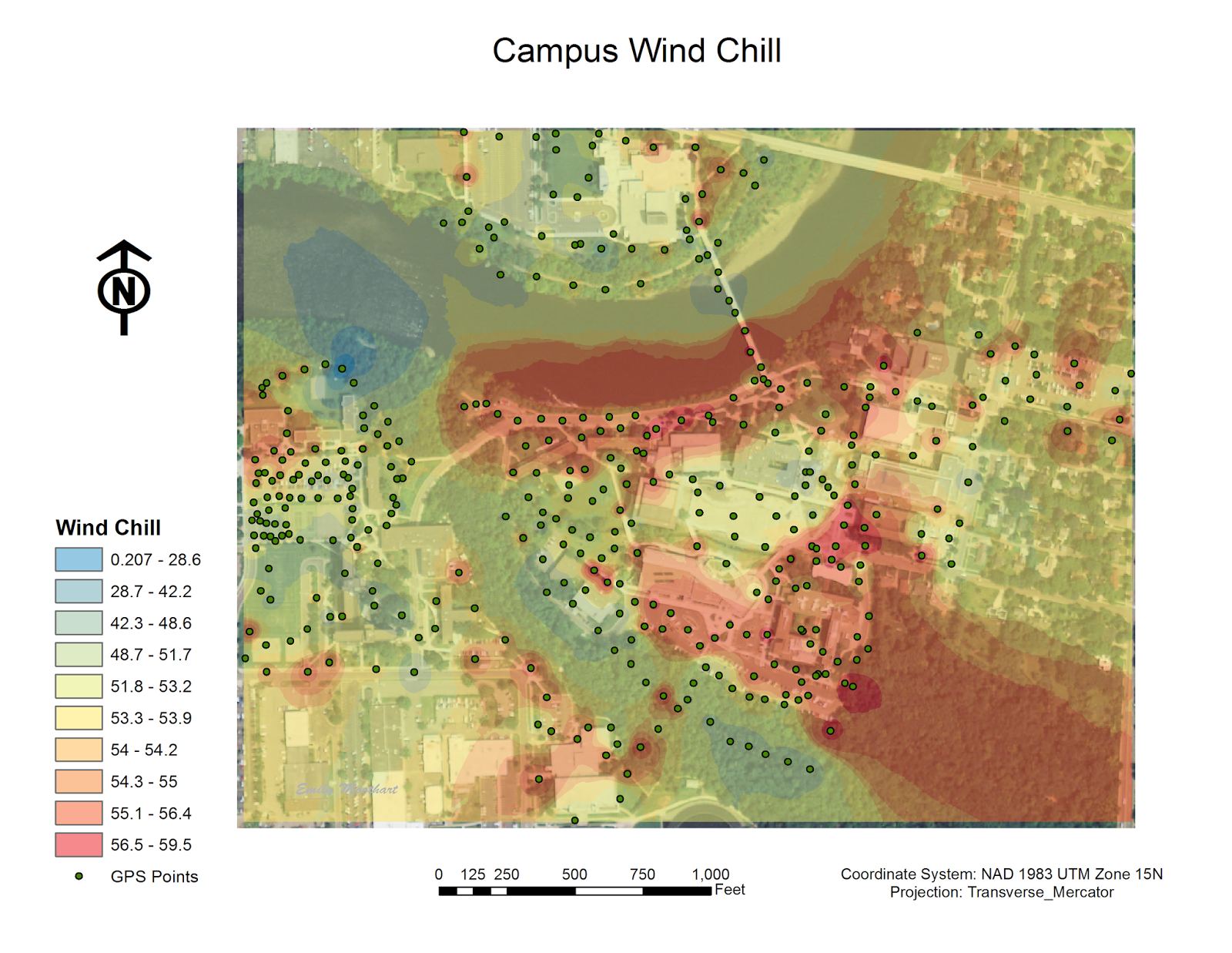
Figure 9. Campus Wind Chill (Fahrenheit). Not surprisingly, the highest wind chill was along the river. It was surprising when analyzing the data that there was still fairly strong winds in parking lot behind the Davies Student Center (the lower central area indicated in red).

Ground cover is determined as the terrain type on a given surface such as grass, black top, snow, gravel, open water, sand, concrete, and other (such as woodchips). There were a couple of points in the data set that were missing the ground cover data, so those few points were determined as 'undefined' on the map below (see figure 10). Ground cover plays a potentially important role in the measurement of certain weather conditions. One of the more important measurements that would be variable due to this is temperature at two meters and temperature at the surface. If the day had been quite sunny the black top would have likely been much warmer at the surface than at two meters, which would have affected the outcome. According to the data collection records, there really is not much of a difference between the two temperature readings, so this factor does not seem to have played a role on the microclimate data taken on this particular day.

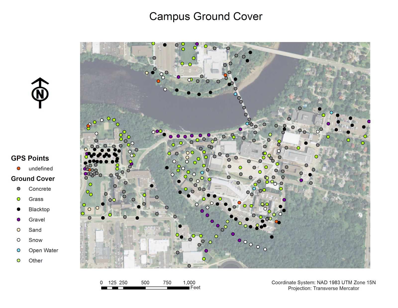
Figure 10. Campus Ground Cover. This displays the variation in surface features in which the data was collected on.

Discussion

From the last geospatial data collection, the temperature outside increased about 30 degrees Fahrenheit. This shows that even if you believe the domain originally set will cover the likely temperatures for the time of year, think again. It is definitely better to have a larger sampling of GPS points; comparatively to last week's test run, this grouping of points allows for a much more detailed spatial analysis.

However, by looking in the attribute table for the data points, there were many errors when inputting the data. One error is that a group failed to measure the temperature at two meters for all of their designated region (see figure 11). Additionally, another group entered '0's into their temperature at two meters column (see figure 12). Both of these mistakes would therefore impact the visual outcome of the IDW interpolation that was performed.

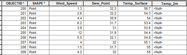
Figure 11. As seen in the 'Temp_2m' column, there were no recorded measurements at two meters, which would have affected the interpolation output for the map.


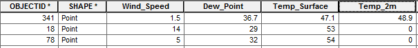
Figure 12. An error was made in the data input of 'Temp_2m' in that '0' was entered, which is a clear outlier in the data. This would therefore skew the interpolation output and range for the data as a whole. 


Regarding the data collected, I was surprised that there was not more of a distinctive microclimate impression directly from the presence of the Chippewa River. There were regions along the river that indicted a similar microclimate, but I would have thought that it would have been more consistent along the river's shore.

In addition, after the three years of living on campus, I have realized that climbing up the stairs to get to the top of the hill next to the river generally has a drastic change in temperature and wind speed as one walks up. It would be intriguing next time the survey is done to take a point at every set of stairs to see the a possible change in climate.

Although we collected all of the points within a two hour period, there was still a lot of variability when it came to the weather readings, especially wind speed in a given minute. To me, this makes it very difficult to overall gather an accurate reading of the campus microclimate. In addition, the class failed to effectively use the notes field during the data collection out in the field. It would have been interesting to know other weather conditions that could have played a part in the outcome of the data.

Conclusion

This particular lab ran quite smoothly because of the attention to detail in the steps prior to the data collection. There would have been a much different discussion if we had been inefficient in deploying our database or if there had been a failure in the database. Due to human error, there are a few circumstances in which the data is incorrect, but as a whole, the microclimate lab was a success. That simply shows that one needs to take time when doing all portions of the lab, and that missing one step can effect the entire class's interpretation of the data.

I feel like after this lab I have a really good handle on how to create a reliable geodatabase and know how to confidently deploy it, collect the data, bring it into ArcMap, and analyze the data. This knowledge will help immensely in future geographical activities so that more attention can be given to the data analysis, not just the data collection. Having this course has really helped with gaining a solid understanding of how to use ArcMap in many applications that will be useful in the future.